A good alternative for small projects
Gantt charts are a popular way to keep track of projects, especially for teams that need to keep the duration of a task in mind. By using a Gantt chart effectively, you can make sure different tasks don’t interfere with each other, and even determine when one should finish so another can start.
There are several ways to make Gantt charts, but in this article we’ll show you how to make one in a program that you probably have available: Microsoft Excel. Though it probably won’t outdo custom-made software when managing a large number of tasks, for small projects it’s a perfectly good alternative.
How to Create Gantt Charts in Microsoft Excel
The nice thing about creating a Gantt chart in Excel is that you probably already own a copy of the spreadsheet and know how to use it. If not, we recommend you check out our Excel tutorial. Most recent versions of Microsoft Excel (we’re using Office Online for this guide, though you can also get Office 365 for free) have a Gantt template included, so let’s take a quick look at that before we show you how to make your own.
Microsoft Excel Gantt Template
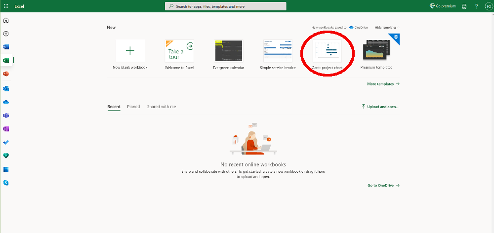
Before starting to build a chart from scratch, please note that there’s a Gantt template included in Excel. If you’re using Office Online, it’s one of the available Workbooks in Excel’s home screen
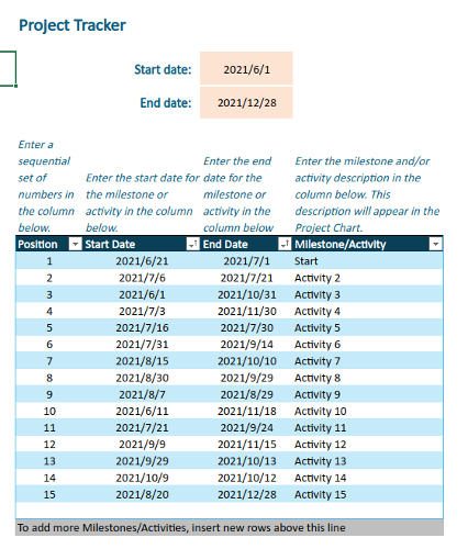
The Gantt chart template is pretty good. You can enter your data in a table, which then automatically exports the data into an inverted bar chart. We recommend messing with it a bit to see what’s possible with Excel Gantt charts. However, the template is a bit inflexible, so if it doesn’t work for you then you’ll have to build your Gantt charts from scratch.
Making Your Own Gantt Chart
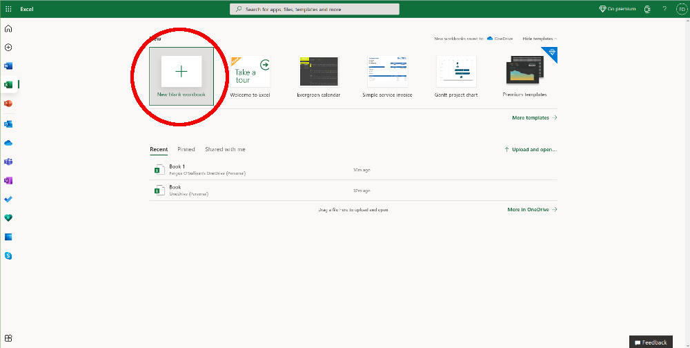
- If you want things to be exactly the way you like, you’ll need to start with a blank workbook. To do so, select the button new blank workbook from the topmost bar — it’s all the way to the left — and wait for it to load. Once that’s done, you’ll be presented with a blank spreadsheet.
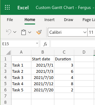
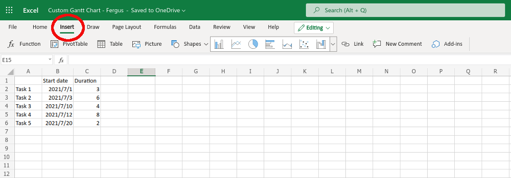
- Before you can make the Gantt chart, you need to put together some data. For illustration purposes, we’ll pretend we have five tasks and number them 1 through 5. Those go into column A. In column B, add some fictitious start dates four the tasks — make sure the cells are set to accept dates. Finally, in column C, set the duration of each task in days.
If you want, you could also add an end date in column C, then subtract the dates automatically and have the resulting duration be displayed in column D. However, just for purposes of setting up the Gantt chart, the start date and the duration is enough.
- With the dates ready, the next step is to create a stacked chart based on the start date of our tasks. For that, you need to select all the data in the table, from A1 to C6, and then select insert at the top of the page (read all about making charts in Excel).
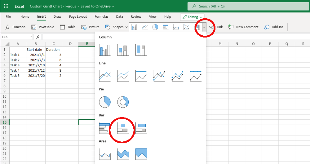
- The toolbar will change to a number of graph options, you need to go to the graphical options and click the down arrow. A long list of options will appear, under bars pick stacked bar. Make sure not to pick the one called 100% stacked bar as that won’t work.
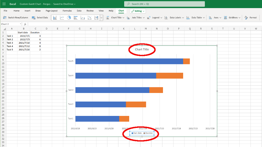
- Microsoft Excel will get to work and a new chart will pop up in the middle of the screen. This is the beginnings of your Gantt chart, though you’re not there yet.
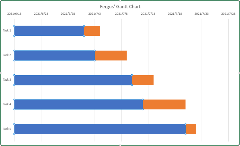
- For one, you’ll probably need to resize the window (we already did that in the above example), then rename the chart by clicking on the chart title box. While you’re at it,. Also remove the legend at the bottom of the chart — where it says start date and duration — by selecting it and hitting the Delete key on your keyboard.
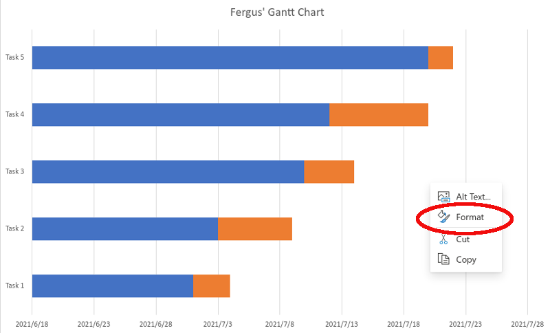
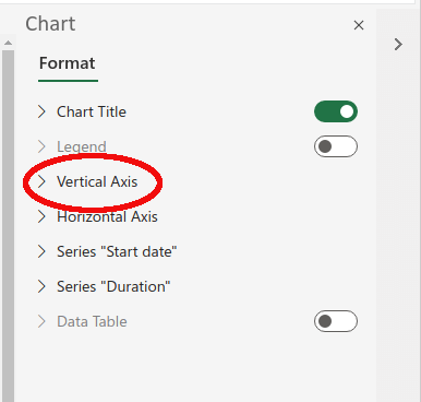
- Next, you need to reorder the chart. Right now, task 5 is at the top and task 1 is at the bottom, and it needs to be exactly the other way around. To fix that, right-click anywhere on the chart and select Format in the dialog box that appears.
- A new task bar will open up on the right side of your screen, called “Chart.” From all the options, choose Vertical Axis.
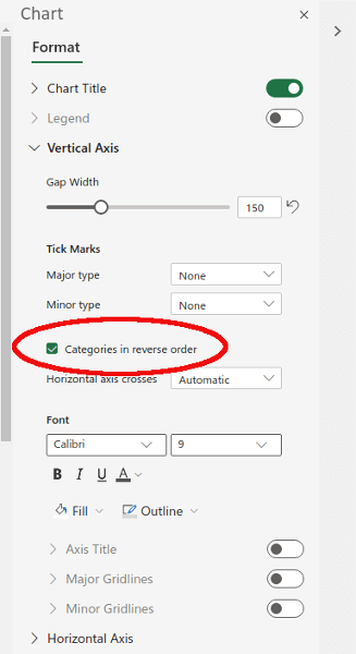
- In the menu that folds out, check the box next to the setting that says categories in reverse order. That should put task 1 on top in the chart.
- With this done, there’s only one step remaining, namely removing the blue part — which represents the start date — of the bar from the chart. After all, in a Gantt chart you only care about the duration of tasks; the blue bar is just getting in the way.
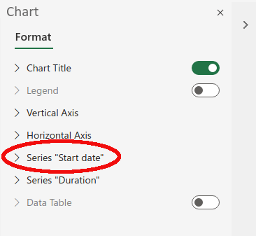
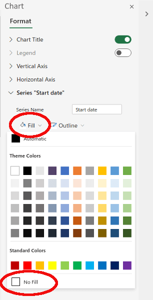
- To get rid of it, right-click any of the blue bars. Another format box will pop up; click it. Once again, you’ll have the right hand pane open up. This time, though, we need to click on the entry for Series “Start Date.”
- In this menu, click on the item that says Fill, then on the large color menu that pops up go all the way to the bottom and select No fill.
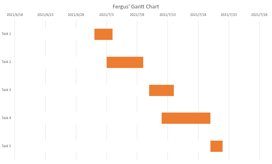
With that, your Gantt chart is all done. The orange boxes (you can recolor them using the fill command if you want) show when a certain task is being worked on.
Gantt Charts in Excel
That should be enough to get you started with making your own Gantt charts. Though the templates that Excel offers — not to mention tailor-made project management software — are probably a better option if you plan to manage many tasks, using a homebrew option like above might be better if you’re keeping track of a small number of tasks or want to add some easy flavor to presentations.


